Shopping Tiles

Important update · Closed beta
Shared shopping lists and synchronization
I made a new version of Shopping Tiles that lets several people use a shared shopping list that updates in real time.
The new version is available through closed beta testing. The older offline version remains freely available on Google Play and the App Store.
Synchronization UX
One of the main self-imposed requirements for list synchronization was that other users see changes as soon as they arrive. Technically this was achieved through WebSockets. But real-time changes to interactive elements require special care. Handling added tiles was already solved: they appear without moving existing tiles. For deleted tiles I introduced tombstones. If a tile is deleted while the user is viewing the shopping list, it leaves a faded, non-interactive placeholder rather than disappearing and potentially shifting other tiles. This is important because the user could be trying to tap a tile just as an update arrives. Clicking "minus" clears existing tombstones alongside the user's highlighted tiles.
Accounts and Groups
It was important that the app retains its original offline functionality if the user chooses not to create an account. Creating an account allows the user's shopping list and Product Catalog to be stored on the server and synchronized between their devices. Multiple devices can be logged into the same account.
The app becomes truly useful when one user invites another to join their Group through a single-use invitation code. Anyone in the Group can invite more members. Users can leave a Group at any time and join a different one.
Although these features are individually quite simple, supporting their combinations requires a lot of business logic. A user can edit the list or catalog while offline, sign out with changes still pending, or leave a Group while another device remains connected to it. Each feature needs to behave consistently with the others, including when actions happen on different devices or reach the server in an unexpected order.
Handling conflicting changes and offline activity
Several users can change the same shopping list, including while offline. Simply uploading each device's version of the list could erase changes made by others. Instead, the app keeps track of individual changes and combines them when synchronizing. If two users add the same product, it becomes one entry. If one user removes an item, an old edit arriving from another device should not bring it back.
The Product Catalog is more complicated because users can also rearrange products. Here I wanted to preserve unrelated changes. For example, if one user moves Bread and another adds Milk, both changes should remain. The app compares what the user actually changed with the latest shared catalog. If both users move the same product, the later synchronized move determines its position.
Changes made offline are saved on the device and sent when the connection returns. The app also checks for updates it missed. If a request is interrupted, it can be retried without applying the same change twice. This allows users to continue using the app without having to manage synchronization themselves.
Server implementation details
I implemented the server in Java using Spring Boot and PostgreSQL, hosted on AWS. Elastic Beanstalk manages the application server, while RDS hosts the database. Keeping persistent data separate from the application server allows it to survive application updates and server replacement.
WebSockets deliver changes to connected users without requiring devices to repeatedly ask for updates. When reconnecting, devices normally download only the changes they missed. Custom images are uploaded only when the server does not already have them. Database connections are pooled, allowing requests to reuse existing connections rather than establishing a new one each time.
Related changes are performed in database transactions. For example, joining a Group and importing its new member's content must either complete together or leave the original state intact. The server checks access against the user's current Group membership, and database locks coordinate simultaneous changes. Automated integration tests cover conflicting requests, retries, and recovery from failed operations.
Try the beta
If you would like to try the new version, please contact me by email to request access to the closed beta.
Original Demo
Introduction
Shopping Tiles is a visual shopping-list app designed to make creating and using a shopping list as quick and effortless as possible.
Unlike most other shopping list apps, Shopping Tiles heavily relies on images. This makes adding and removing entries much more visual and quick. You don't need to read, you see the product and immediately know what it is. Also images are more information dense and take up less screen space.
Essentially you have one screen with your favorite products, which you can customize: add/remove, create groups, move products between groups, add your own pictures etc. Highlighting a product sends it to the shopping list screen. Long pressing lets you add it with a text note. You can also create text-only reminders, but as you type them, the app will suggest relevant pictures you might want to use.
Features
- Most interactions only take 1 or 2 clicks
- Shopping list can contain three types of tiles: image, text, and image+text
- Fully customizable page from which user can add products to their shopping list with a single tap
- Built-in gallery with 130+ easy-to-recognize products
- Ability to add custom images
- Relevant product images are suggested as user types a text entry
- Light and dark modes
- Support for multiple languages
Interface
The main screen contains the shopping list. This way the user can see and interact with their shopping list right away when opening the app. Each tile represents one shopping list entry. Tiles are aligned to the bottom of the screen to maximize easy reach.
To remove an entry the user first selects one or more tiles and then clicks "minus" button to delete them. I think this system provides a good balance between ease of use and protection from misclicks. Also users are free to decide what selecting a tile means for them. Some may highlight items they will look for next, while others might highlight things that are already in their basket.
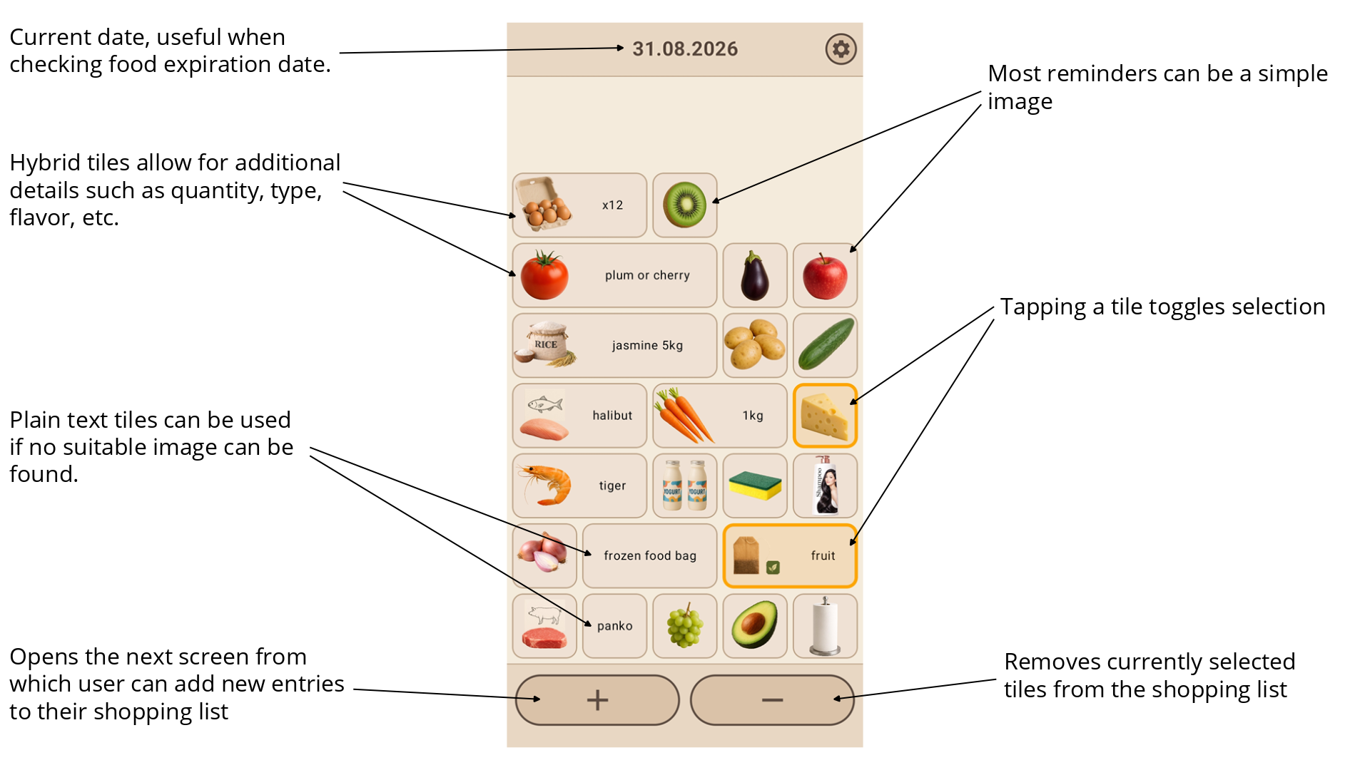
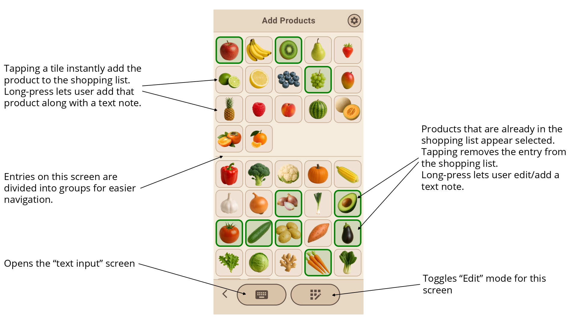
To add new entries to the shopping list the user clicks "plus" button, which opens the next screen. The primary design goal for this screen was to allow for the user to add an entry to their shopping list in as few clicks as possible. In most cases a relevant product image should be there and a single click will add it to the shopping list. Since every user has different shopping habits, this screen must be highly customizable.
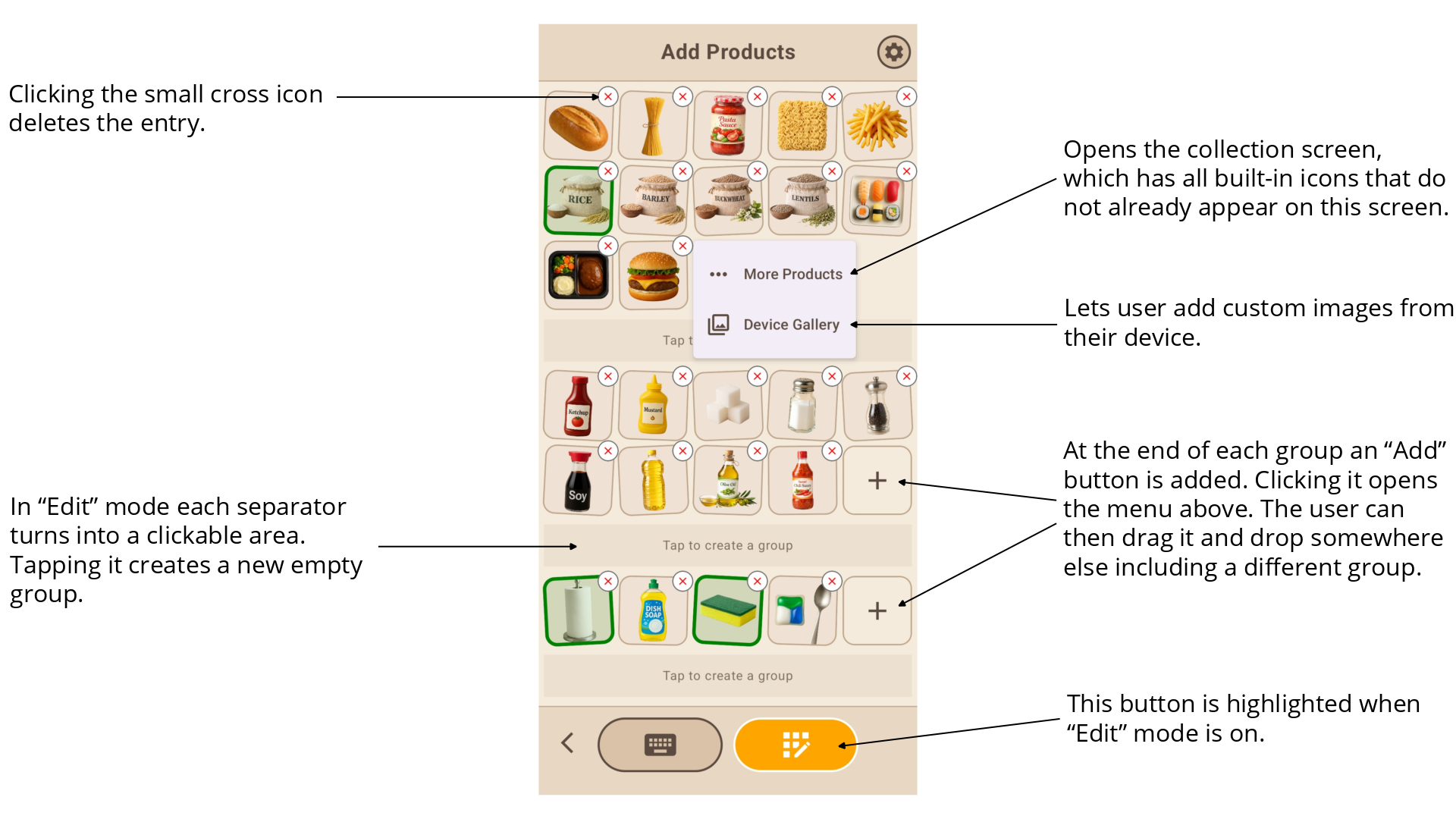
Clicking "Edit" button enables Edit Mode. In this mode tiles become draggable (indicated by subtle rocking, just like the one used when dragging app icons) and group dividers slightly expand to become clickable.
The primary design goal for this screen was to enable all possible customization operations while making them intuitive and easy to use on a phone screen. Any tile can be dragged and dropped anywhere, even in a different group. A tile can be deleted by tapping the small corner icon with the cross. New tiles can be added via the "plus" tile, which provides multiple options. New groups can be added by clicking on areas above and below existing groups. And a group can be removed by leaving it empty and exiting Edit Mode.
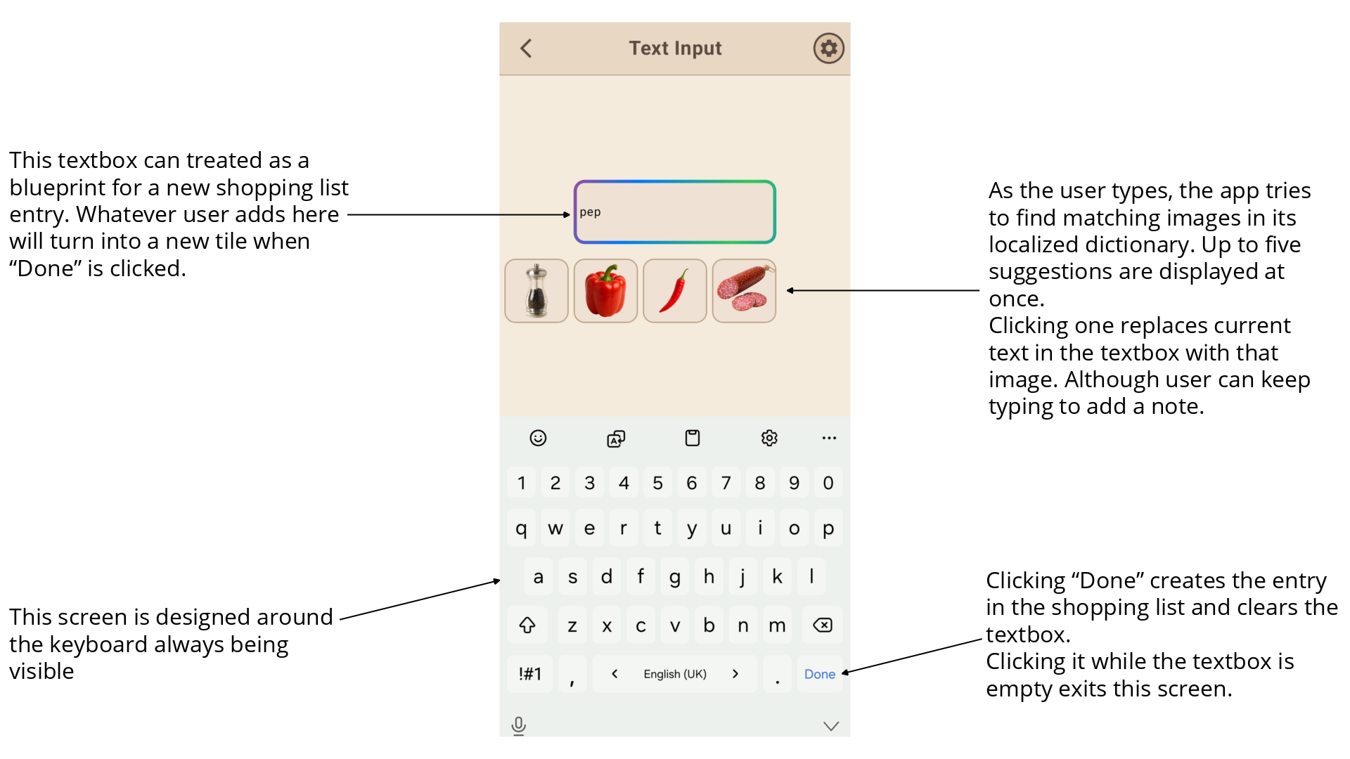
Occasionally the user will be in a situation where no suitable image exists in the app. While ideally they should add a custom image if they buy this item often, if that's not the case, they can just add a text note. This is done by pressing the keyboard button, which opens the screen below.
This screen is designed around keyboard input. Here the keyboard is not something that just pops up, but an integral part of the screen. As the user types, the app will try to suggest relevant images. The idea here is that the user might not know or forget a certain image exists in the app. One side effect of this system is that this screen can be used as an alternative main method to populate a shopping list quickly. The user just types the first few letters of a product and taps suggested images when that's relevant. Then they click Done, an entry is created, and the screen is ready for further input. This method best suits users who like typing or often use notes and text only reminders.
A variation of this screen is used when the user long-presses a tile.
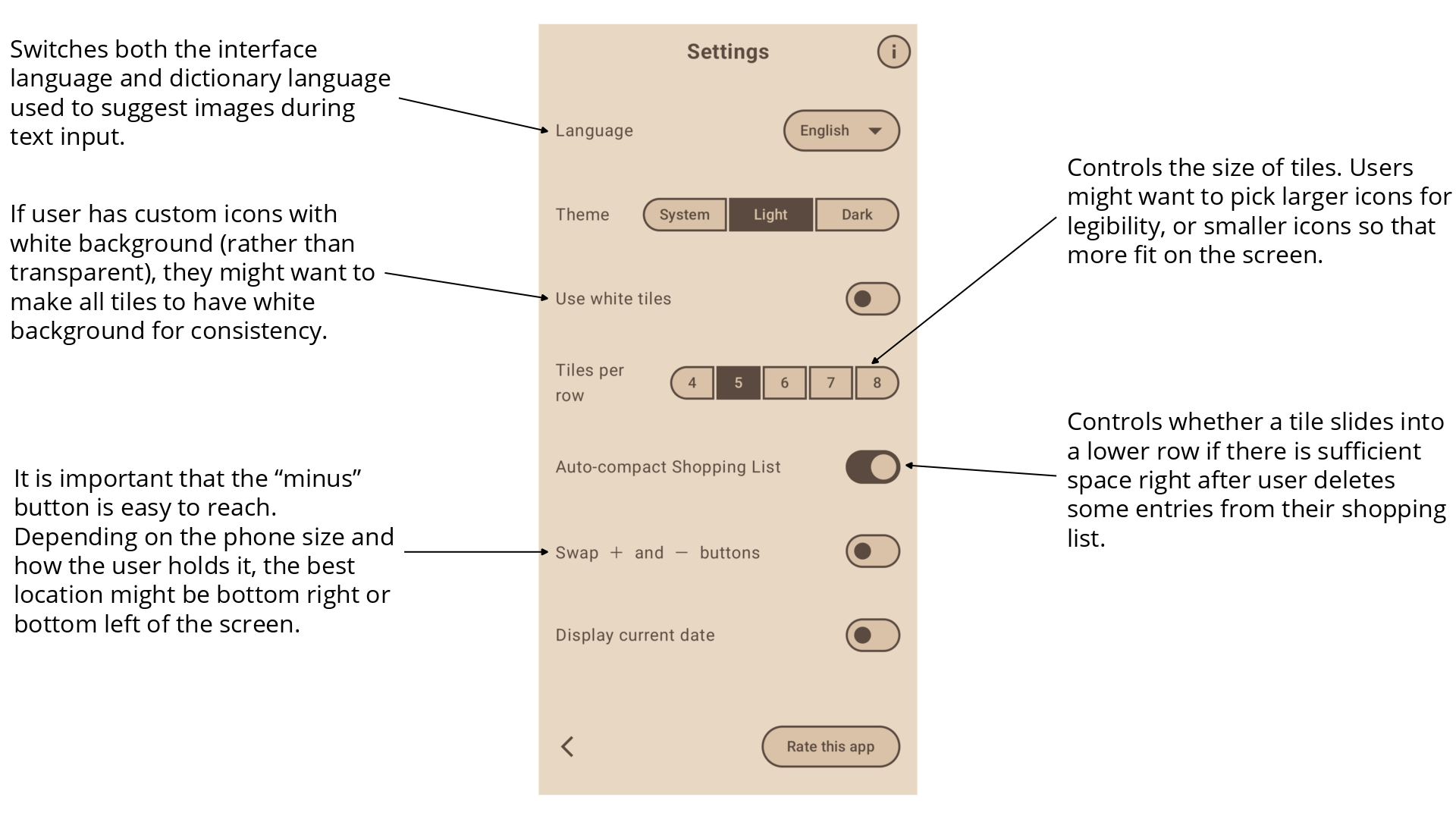
Settings screen can be accessed from anywhere in the app with a single tap. Here the user can adjust the app even further to suit their needs and habits.
Implementation Details
The app was implemented using Kotlin Multiplatform and Compose Multiplatform, allowing me to develop the Android and iOS versions from a largely shared codebase. Only around 0.6% of the codebase is written in Swift, with platform-specific code kept mainly for functionality that needs to interact directly with the operating system.
As the app uses a large number of images, it was very important to reduce the size of every image while retaining image resolution and quality. During development the size of the app became three times smaller while the number of images increased. Thanks to the use of webp format and a careful use of compression at the moment download size for new installs is 7.74mb despite the app containing 137 500px by 500px product images with transparency and no noticeable compression artefacts. This means the app has plenty of headroom for product library growth. Lighweight images also had a positive impact on "Add Products" screen resposiveness.
Before committing to implementation I first created a set of sketches in Figma. This allowed me to gather some feedback both related to the product concept and UX.
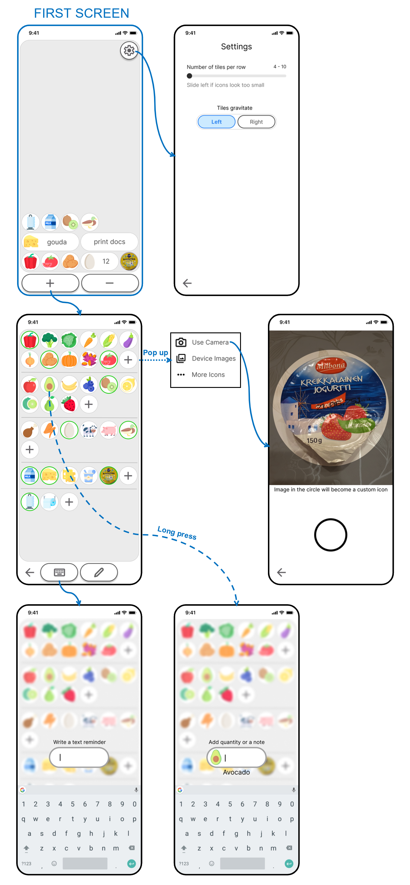
With the help of sketches and feedback several design changes were made. It was decided to make the tiles more rectangular to maximize the use of screen space. And to use realistic AI-generated images rather than icons to maximize legibility and to have more flexibility when communicating various product types. Screen titles were added to make navigation more understandable. And warm sand/beige color scheme was chosen, which was found to fit product images more naturally.