Card-Based Flight Booking
Demo
Introduction
This UX Prototype was made when studying for Professional Diploma in UX Design.
The goal of the project was to design a flight booking process for an airline.
This application uses a series of collapsible cards instead of traditional screens to give the user better view and control over the entire booking process.
Although this approach promised to add a lot of complexity, I thought it was worth a try for two reasons. Flight booking has particularly strong relationship between UX and sales. And I felt that going with an unconventional design would let me benefit the most from feedback and expertise available on the course.
I am particularly happy with how cards swapping with each other help illustrate going back and forth between details of the first and second flight. And how all the cards form a comprehensive interactive summary right before the user proceeds to checkout.
Competitive Benchmarks
First I performed competitive benchmarks for 4 airlines. I picked Aerlingus and Ryanair because they are two major players that compete with each other. I picked Finnair because it has a somewhat unusual frontpage, so I expected to find more unconventional design choices further in the booking process. Finally, I picked S7 because it is not so well known in Europe, so I hoped to come across an unusual solution in its design.
I classified all points into positive (+), negative (-), and just interesting observations that are worth pointing out (?).
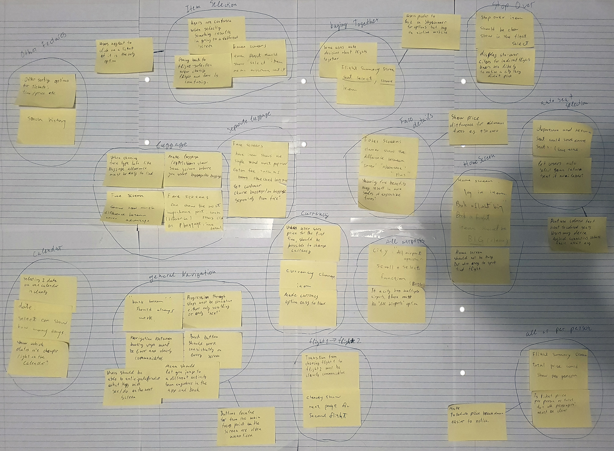
Affinity Diagram
Please click on the diagram to view in high resolution.

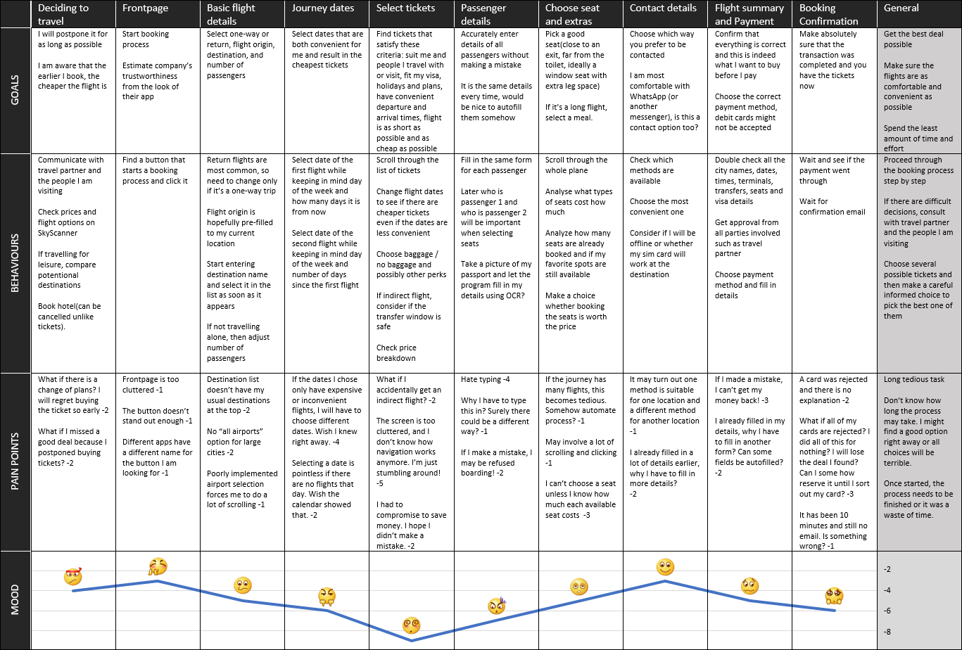
Journey Map
Here I wanted to have a more objective way to define user's mood level for each stage. So, I gave every pain point a negative value that I think corresponds to the impact it will have on user's mood. The mood line at the bottom of the document would then be drawn at the level that corresponds to the sum of pain point values associated with that step. For example, step 1 (Deciding to travel) has two points each with value -2, as such the mood level is depicted as -4.
I also wanted to better express how I think the user would feel during each step. For this purpose, I gave each step a suitable emoji. I think combination of these two approaches helped me create a more accurate journey map.
Please click on the diagram to view as a PDF document.

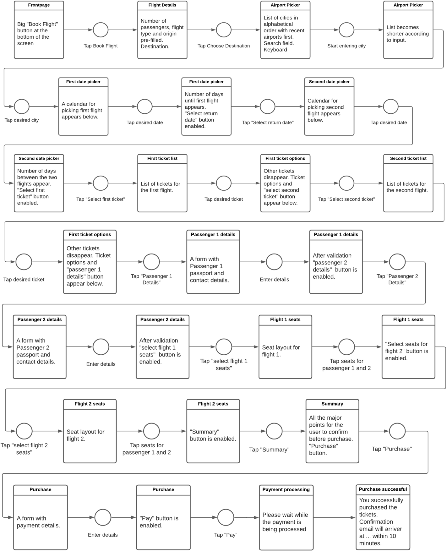
Flow Diagram
Please click on the diagram to view as a PDF document.

Design
While studying usability tests of existing systems I noticed that progressing from one screen to another often disrupted continuity. This problem manifested itself most prominently at the point where user finishes selecting first ticket and finds himself/herself selecting the return ticket. Many users felt lost and disoriented when presented with this screen.
With this realisation I started to think how to make user's earlier choices more tangible and came up with the card-based solution. Rather than screens, each step will be on a card. Every time user completes a step, the card will become smaller, show only the summary of user's choices, and the user will proceed to the next card in the list. This way if they want to see their earlier choices, they just need to scroll up a bit. And if they want to change anything, they just click the corresponding card to expand it.
First, I sketched the entire booking process. The sketches can be downloaded using the link below.
Because the designed system turned out to be highly dynamic and interactive, I chose to make the prototype in the form of an android application. This way I didn't have to worry about constraints of UX prototyping tools. And I was able to properly test how users would interact with nested vertical scrollview that my design involved.
The prototype can be downloaded using the "Download APK" button at the top and bottom of this page.
You can also view a detailed demonstration of the prototype in the Demo section at the top of the page.
Finally, I created a wireframe that includes functionality details that didn't make it into the prototype.
